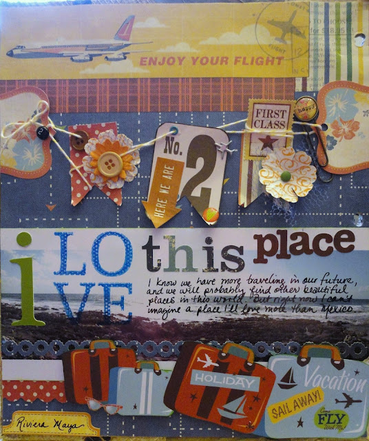
When I decided to put my Mexico trip pages into my regular chronological album for 2012, I knew that I still wanted to use this decorative cover (above) that I purchased on our trip.
So I punched new holes and decided to decorate the inside of the cover, too. I'll just use it as a divider within the larger album.
I will admit to a bit of "splitting hairs" on the rules for this challenge - maybe we can call it "creative grouping" instead of "outright cheating"? Either way, I'm happy with the end result, so I hope you'll forgive me!
I also scraplifted from this page from Melissa, Stinson, The Scrappy Jedi (who, by the way, was a Master Forger and posted this page for a challenge in July 2011. The Force brought her page full circle :)).
3 Embellishments:
1 - The banner is made of pieces from my kit and from my stash.
2 - I used a stamp with Staz-On ink directly onto my photo.
3 - And I used stickers in the title and the label at the bottom of the page
2 Papers:
1 - I got mileage out of this WRMK Travel Light paper. Between the blocks of pattern on the front and the dots on the back, I was able to cut it into a variety of pieces for the background, the banner, and some trim pieces.
2 - I cut the suitcases from an old piece of Creative Imaginations paper. Sidenote....I just placed an order from the CI website, because I couldn't remember the name of the paper and I wanted to look it up for this post (still couldn't find it - it's been in my stash for quite awhile). So really this post just cost me $30.
1 Image:
I used this long sweep panoramic photo from our trip. I took several panoramic shots while on vacation. Do you have a panoramic feature on your camera? If so, have you ever printed the photos? Because they can be really long photos, the prints are pretty narrow. If you had it printed on a 4x6, the 6" long print might be 1" high. I had my image printed 12" long, and you can see it's only about 3" tall. I cut the edge from this particular image (it was my first print, sort of an experiment, so I didn't mind cutting it. I probably wouldn't have used it otherwise) to fit the width of this page.
If you're interested, this article talks about the sweep panoramic feature that is showing up on more point-and-shoot cameras. The author links to some sample pictures to get an idea of how neat these photos can be.
I had a hard time finding a way to print them - that's why this particular image was a test for me. I ended up taking the file to a local Cord Camera, where the 12" long print was about $4. I think I'll try a 24" long version and use it on a 2 page layout. But I want to do more editing before I invest in what will probably be a $10 print. It seems like these pictures are more suited for digital use and viewing rather than easily making prints.
So that's the 3-2-1 of this challenge. If you take the challenge, be sure to link it back to this month's Mr Linky at the CKC blog. Thanks for looking!


Creative Grouping has worked really well here - fab page
ReplyDeleteI adore that banner and the way the twine is sort of caught up and looped around. I'm sure it took a lot of work to create this casual look :-) great layout. I did create a panorama once from a series of photos I'd taken from the top of St Paul's cathedral across London and it was about half an inch high if I printed it normal A4 paper! But I think a really nicely printed one, professionally framed for the wall can look amazing. Great job here. Your Mexico pages are a lot of fun.
ReplyDeleteWow, this is great - there is so much to take in and it all works together.
ReplyDeleteFantastic job! Creative license and all, it came out perfect!
ReplyDeletewow you got a lot of mileage out of your LO altogether. well done great page
ReplyDeleteThis is AWESOME!!!
ReplyDeleteForgiven!! A stunning page :0)
ReplyDelete